INBOUND 2021
Art Direction AND STYLE GUIDE
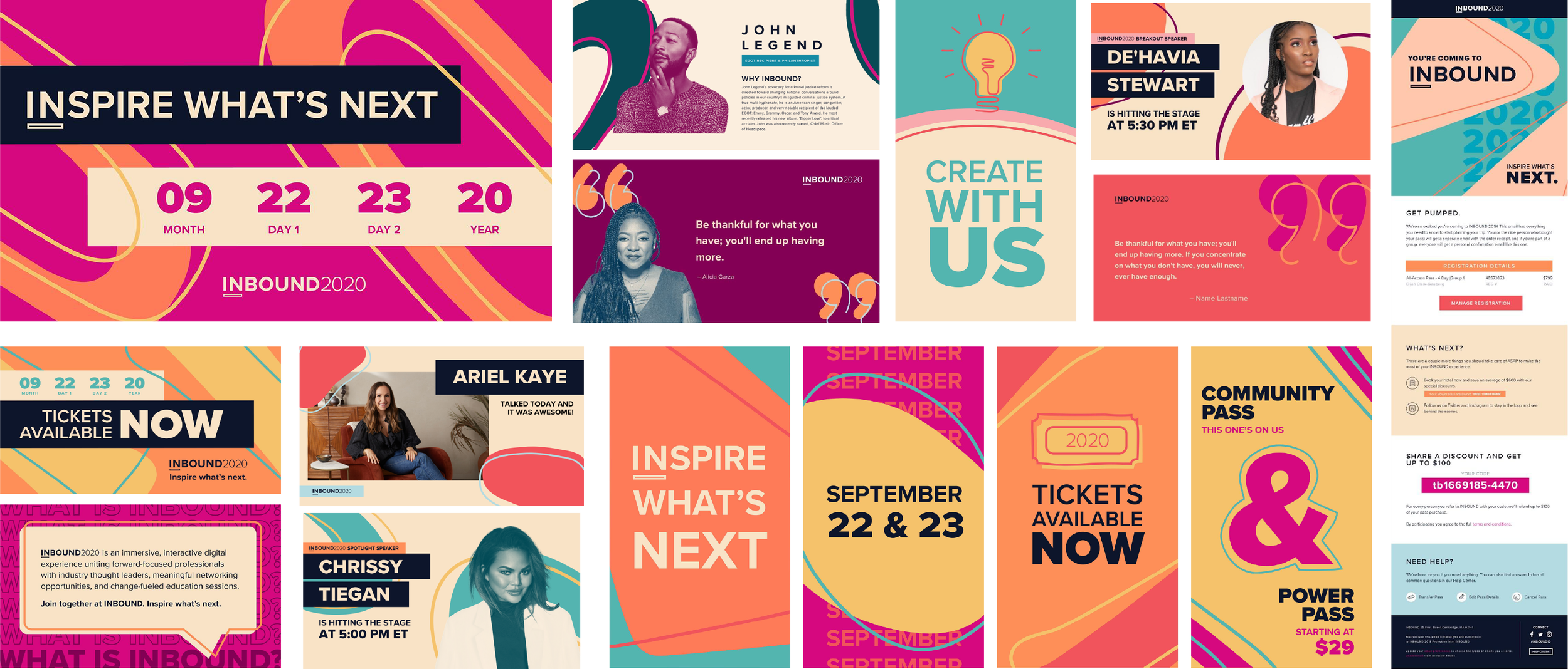
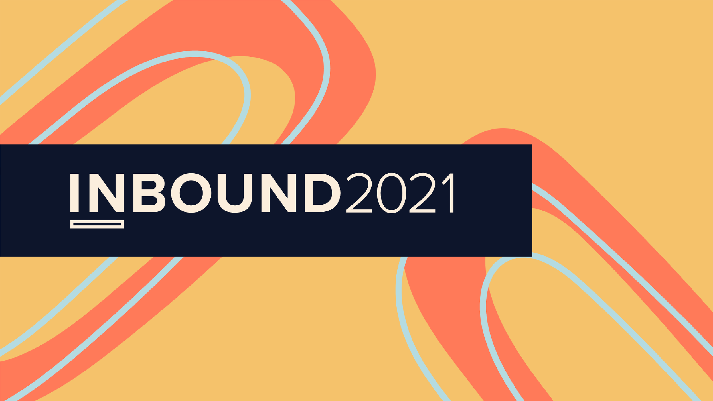
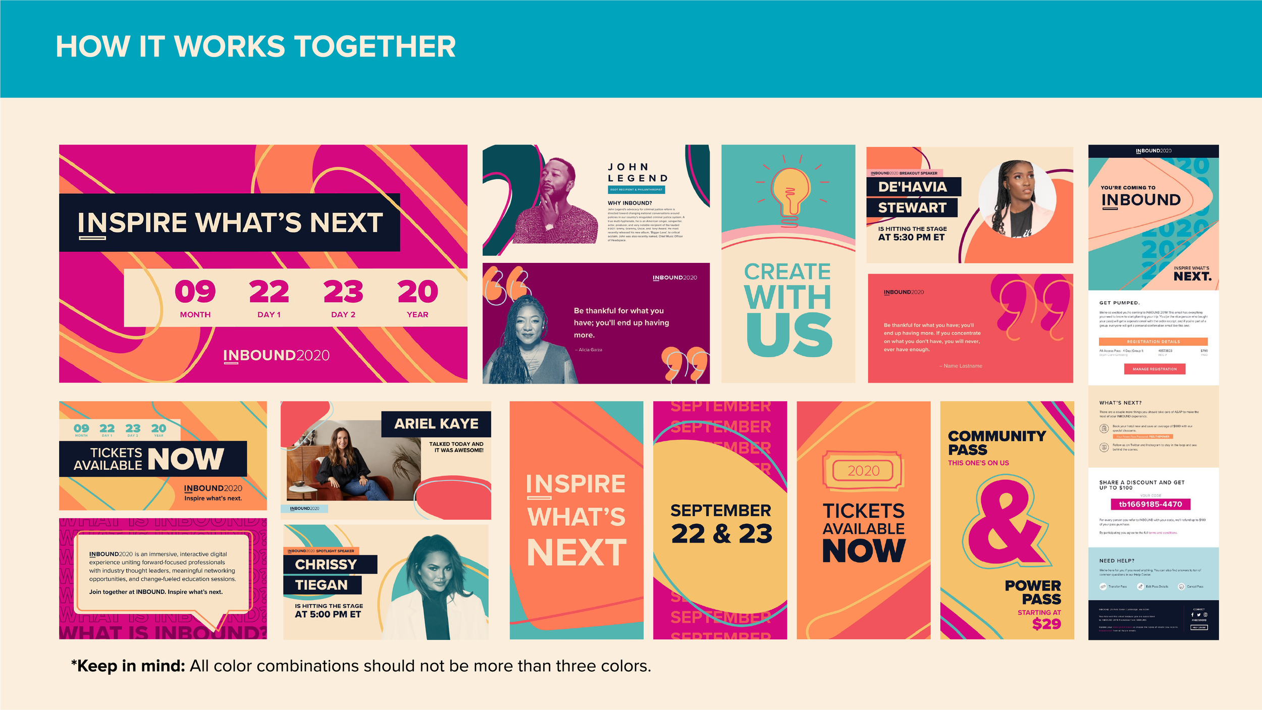
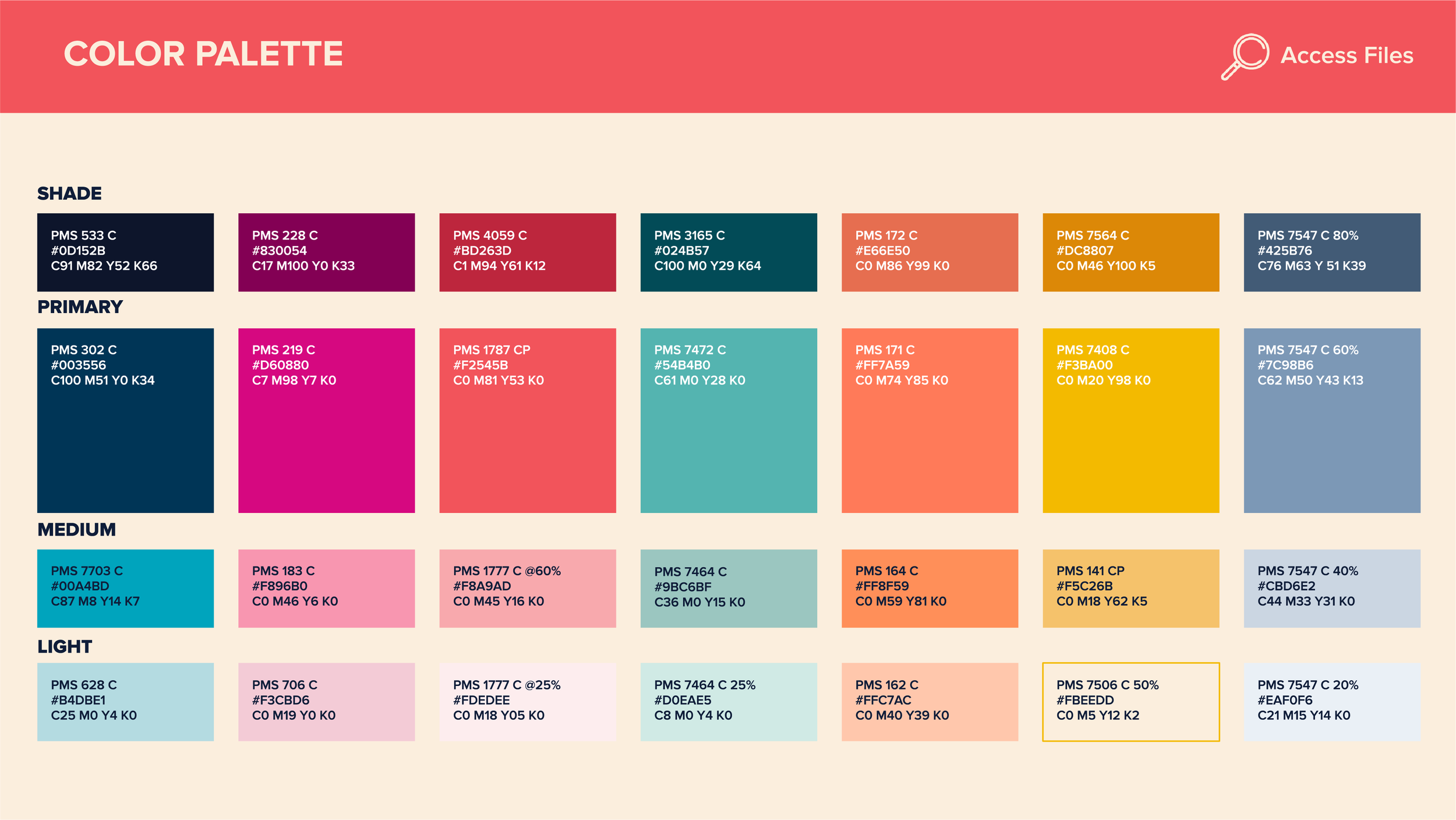
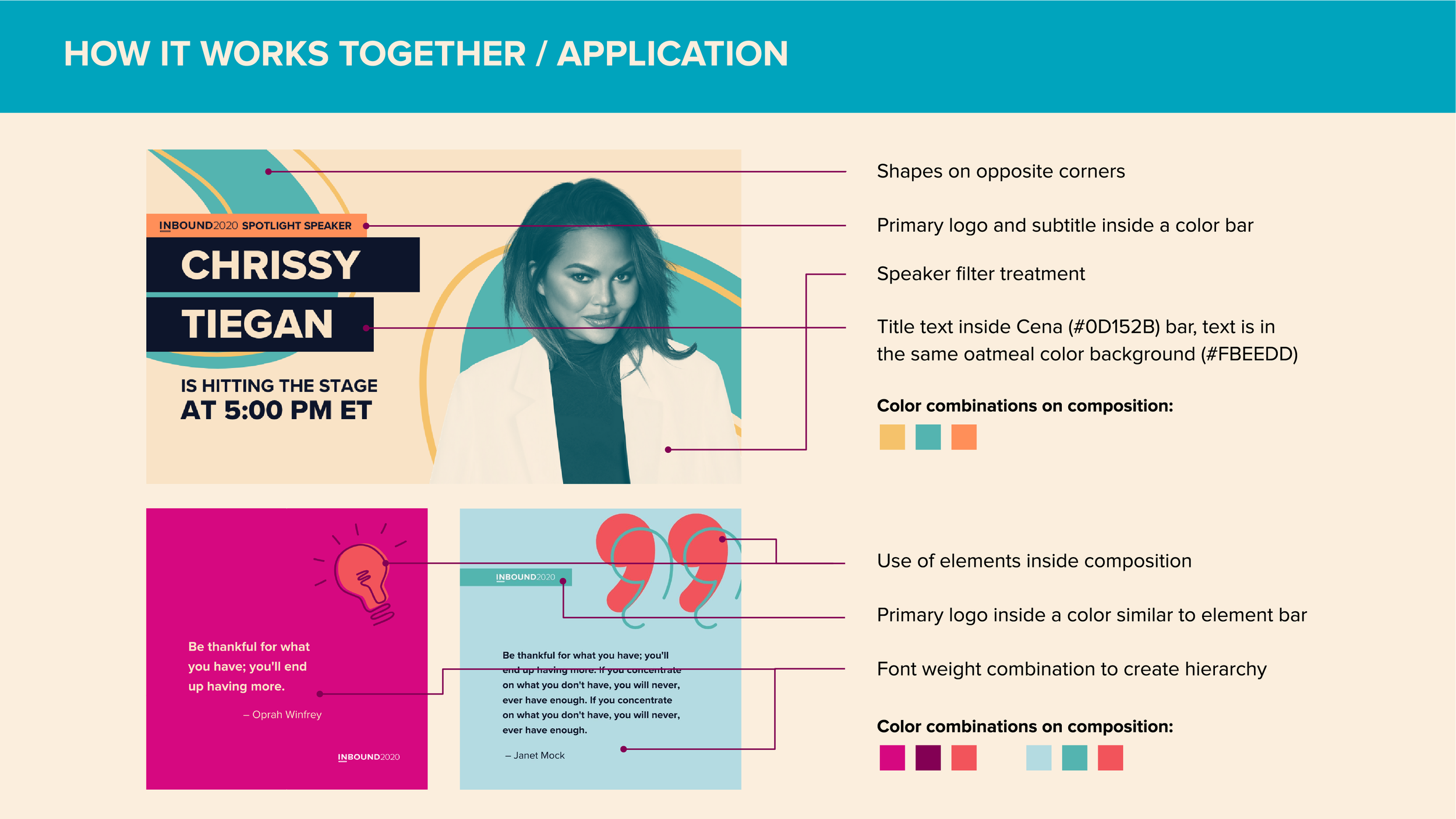
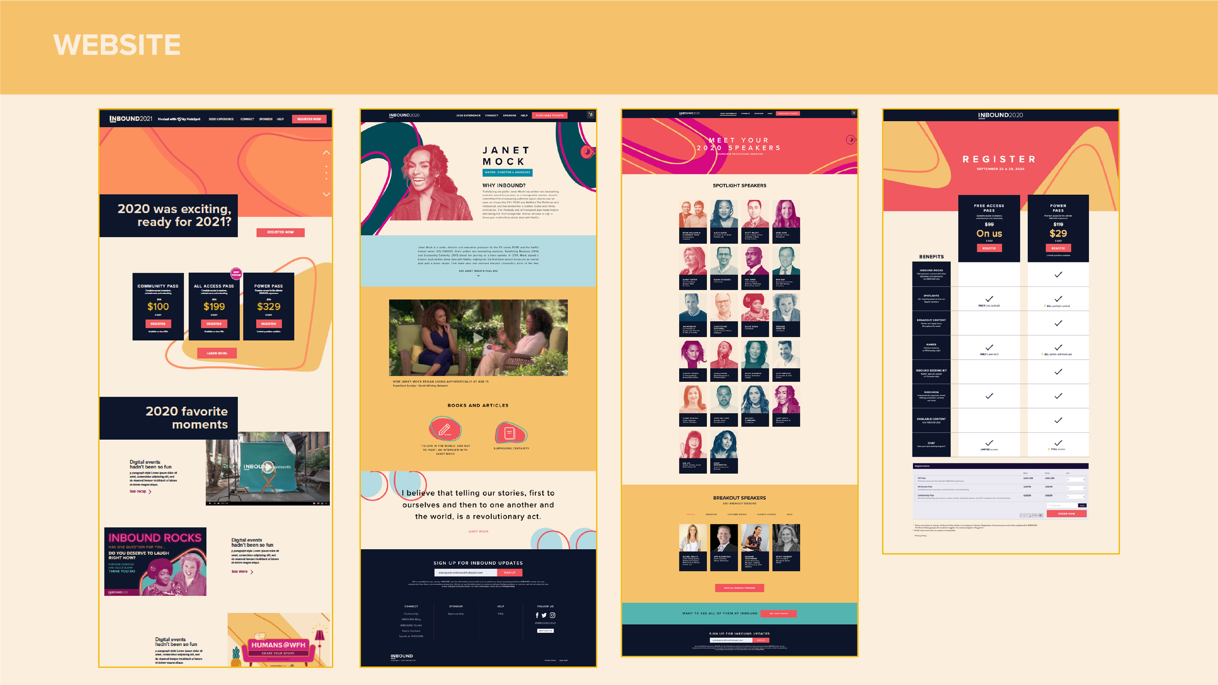
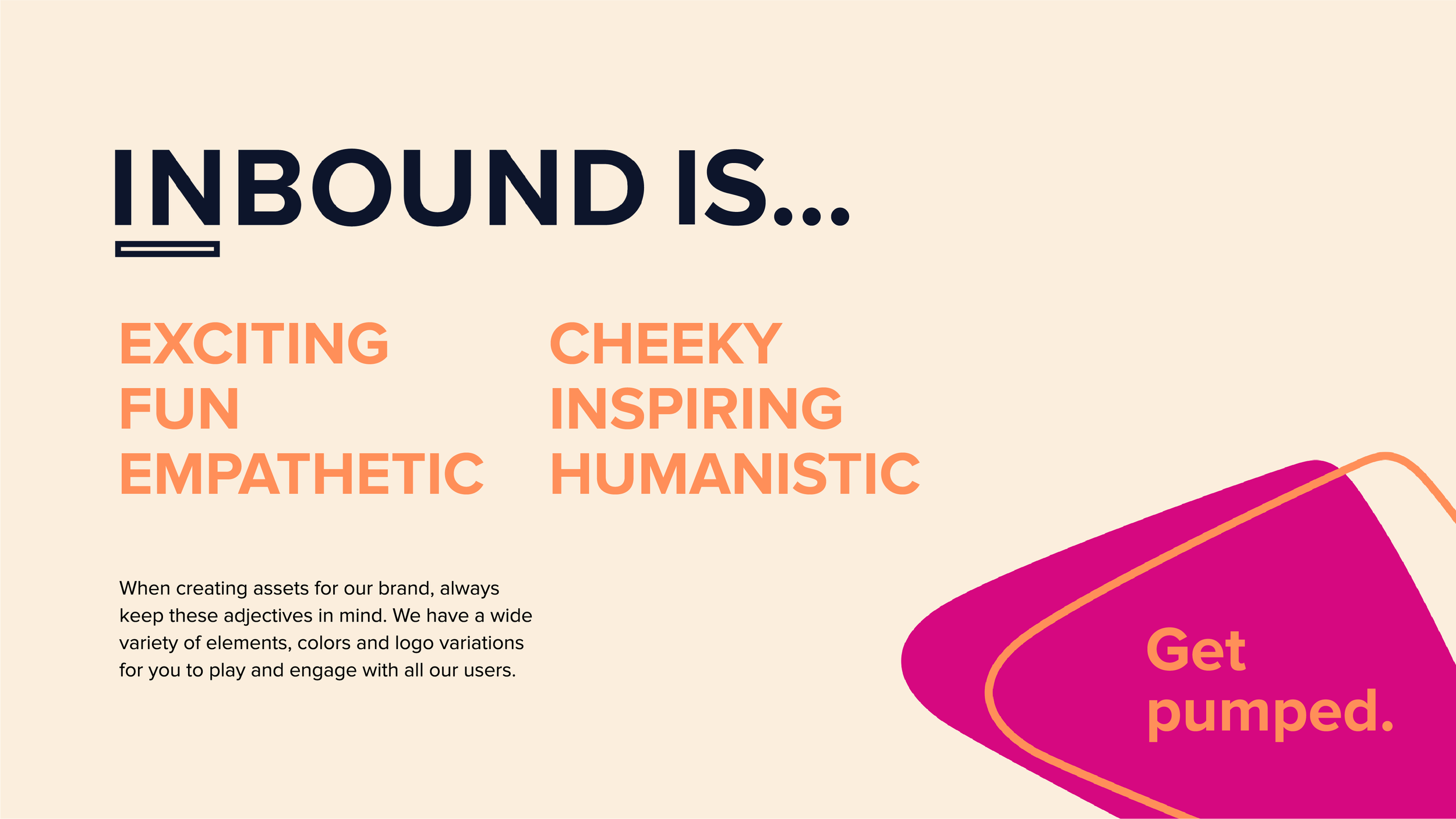
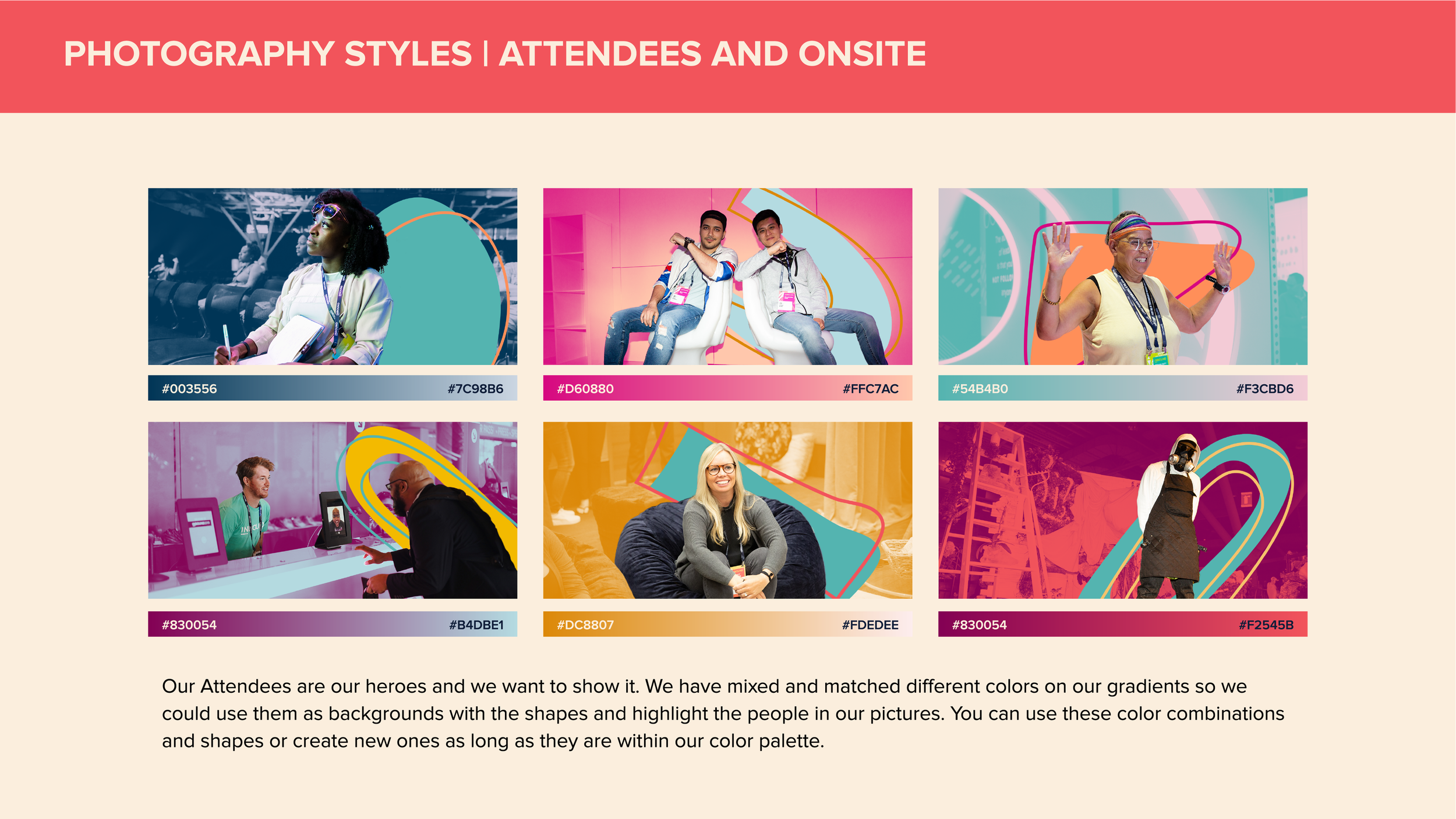
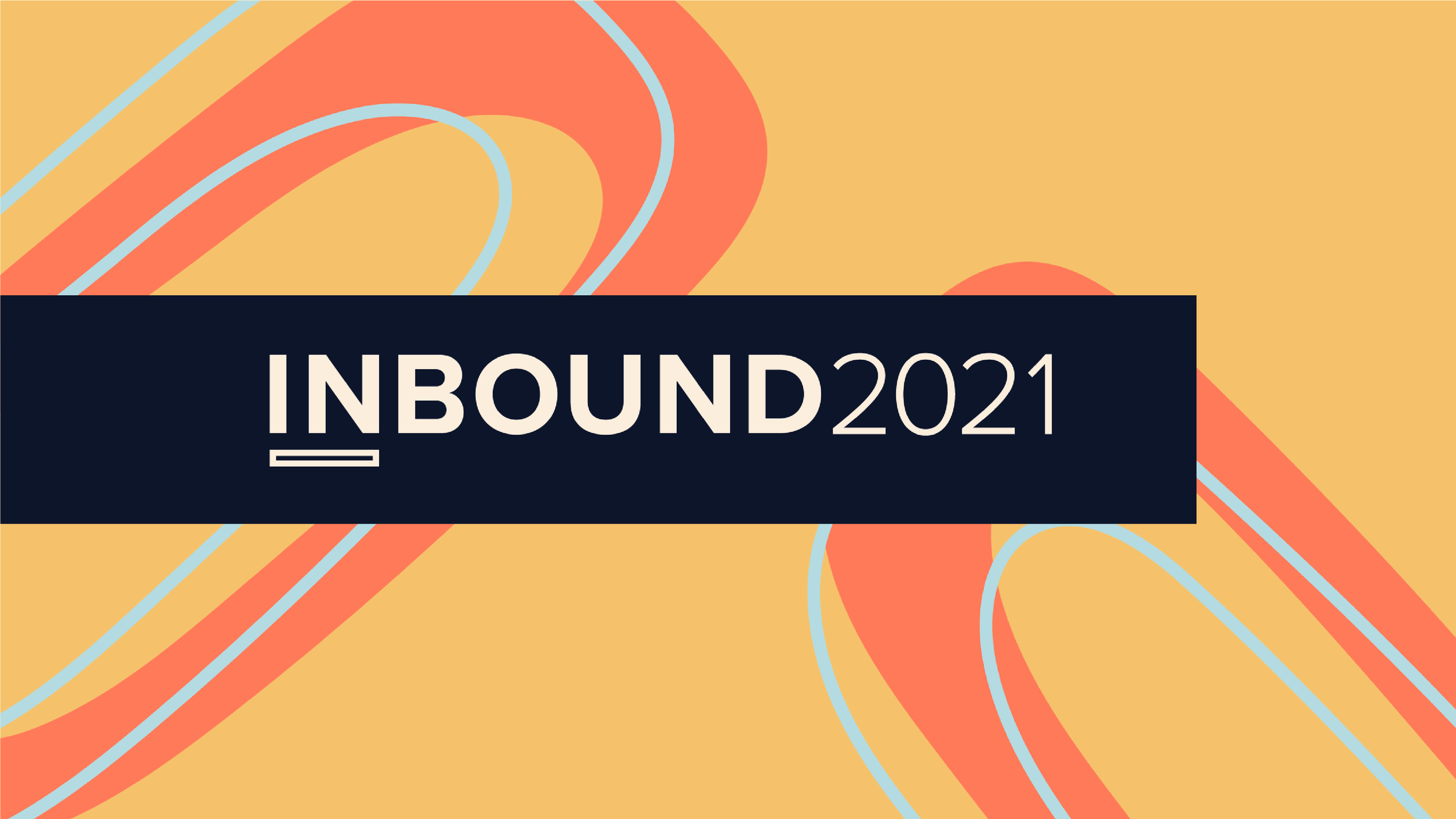
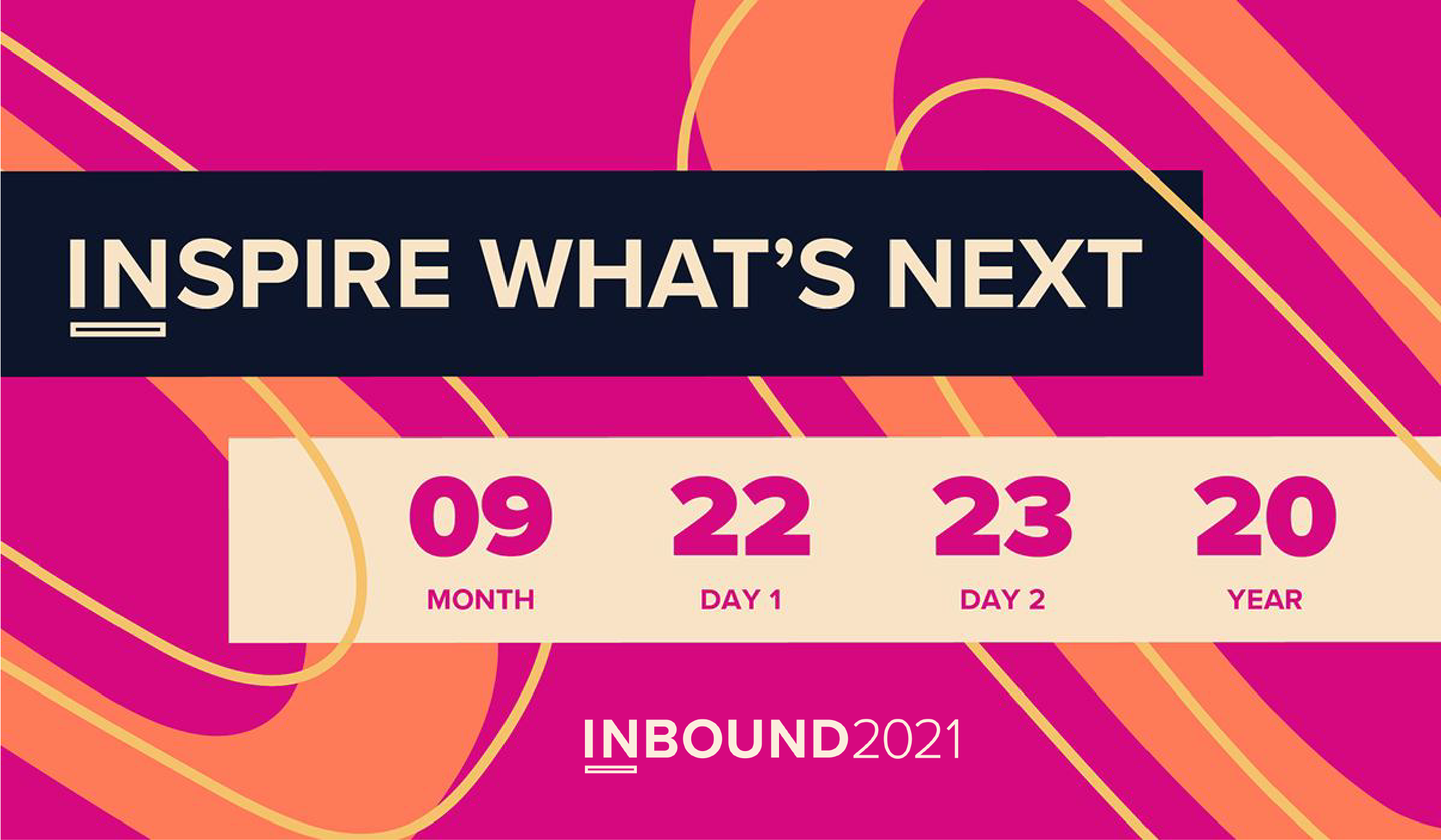
The art direction for INBOUND 2021 was designed to complement HubSpot’s established brand identity while giving the conference a distinctive visual personality of its own. Orange remained a prominent feature, maintaining a clear connection to the parent brand, while a brighter, more expansive color palette introduced a heightened sense of energy and excitement. The goal was to create a visual experience that felt celebratory, playful, and full of possibility, reflecting the optimism of bringing people together to share ideas and imagine what comes next.
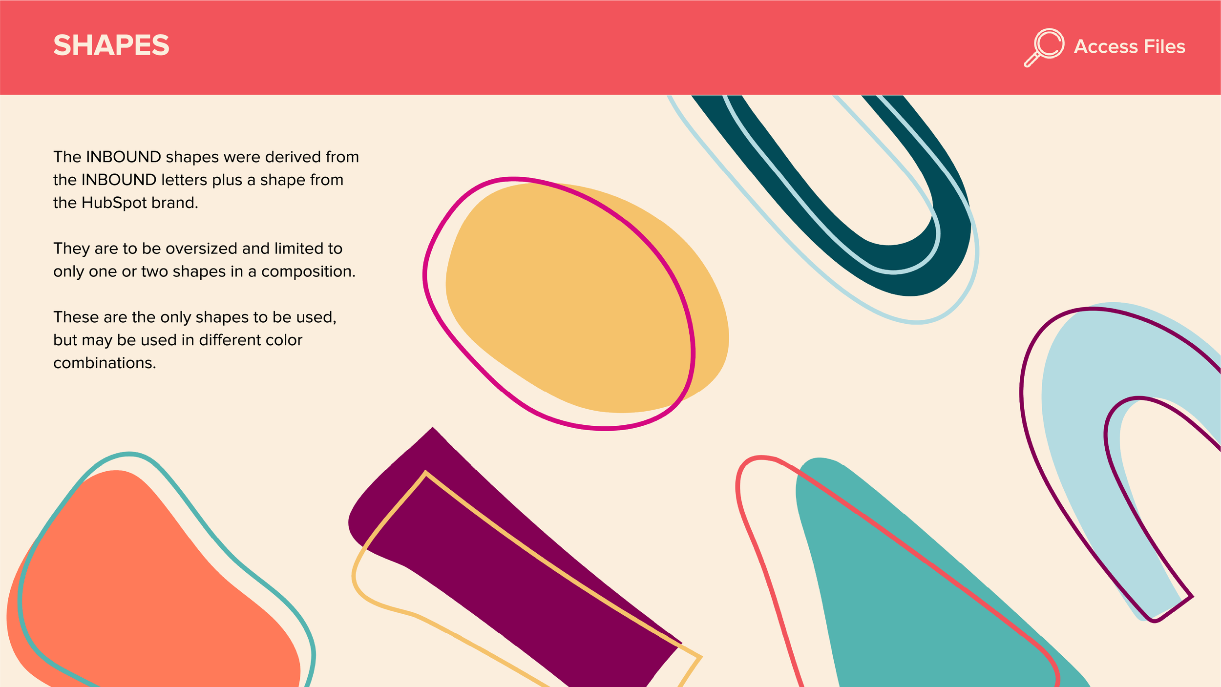
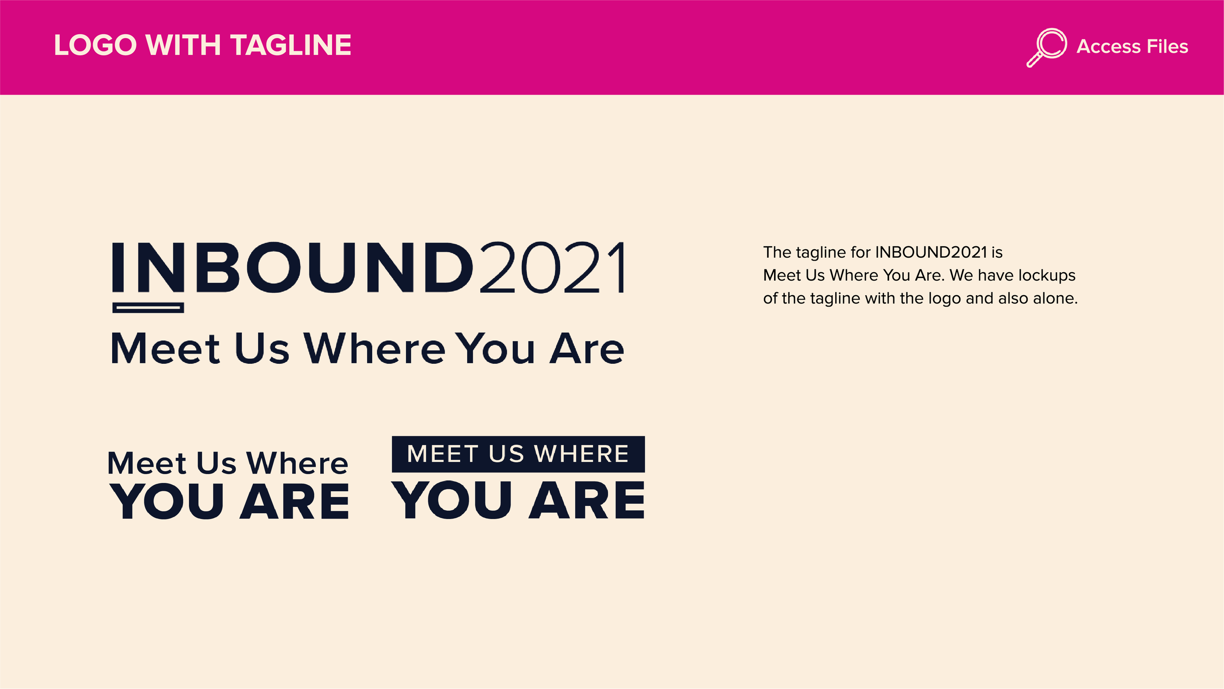
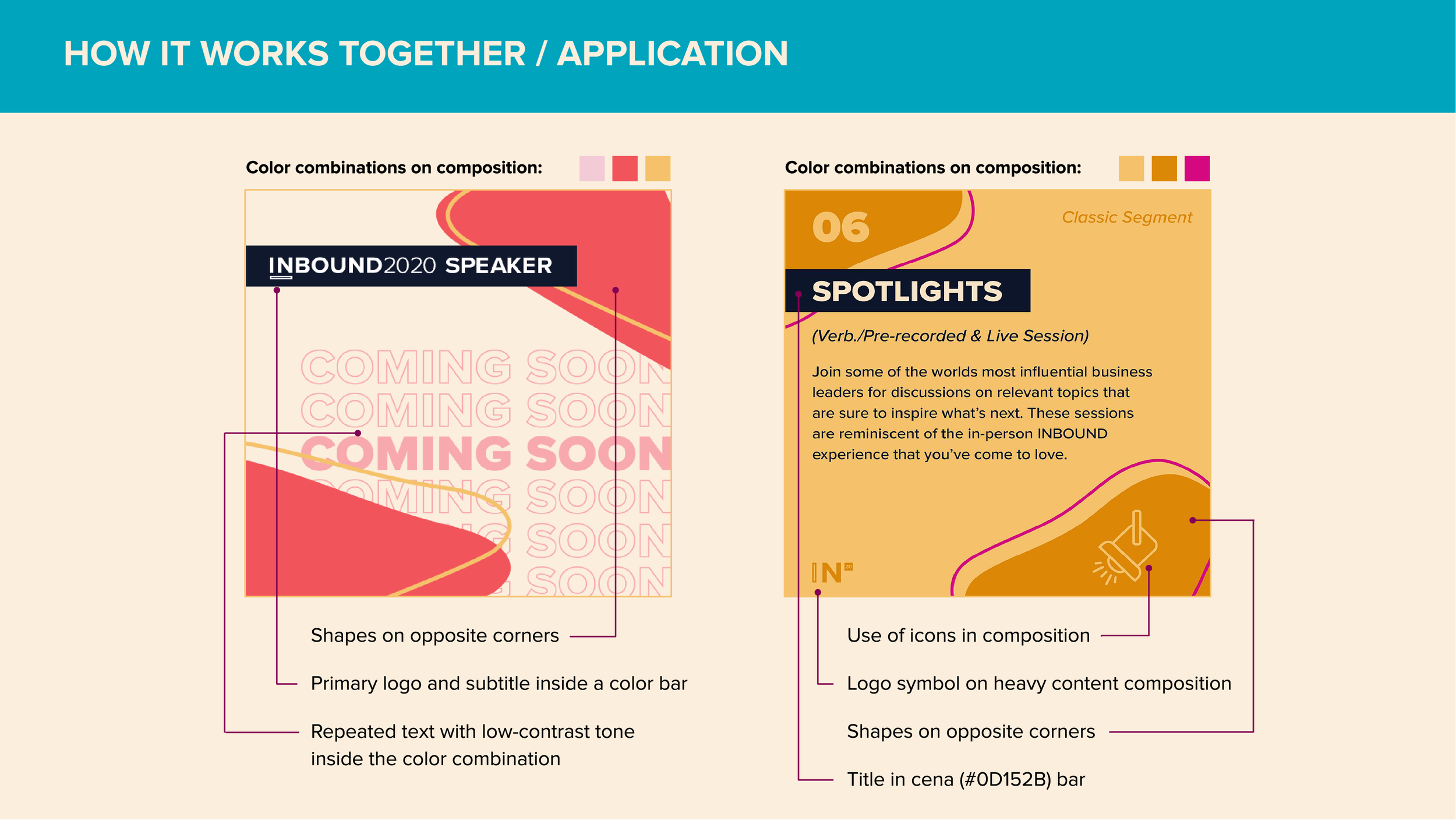
The focus of the visual system are oversized, expressive shapes derived directly from the letterforms of the INBOUND wordmark. These forms are reimagined as bold graphic elements that stretch, overlap, and interact throughout the compositions, creating a sense of movement and visual rhythm. Their scale and playful arrangements give the art direction a dynamic presence, allowing the graphics to capture attention across a variety of event materials and campaign touchpoints.
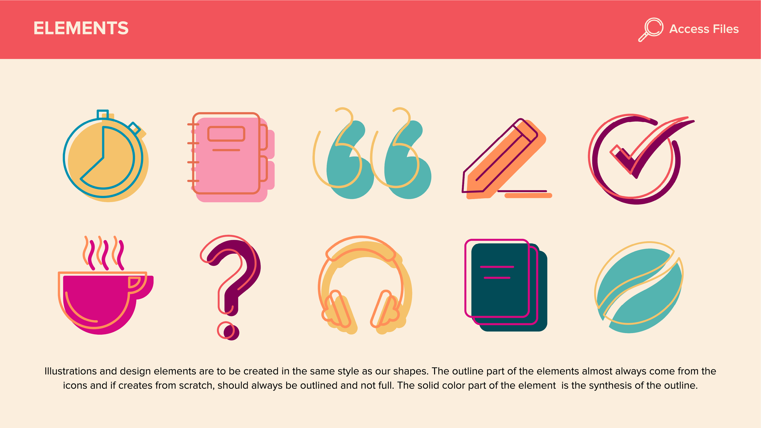
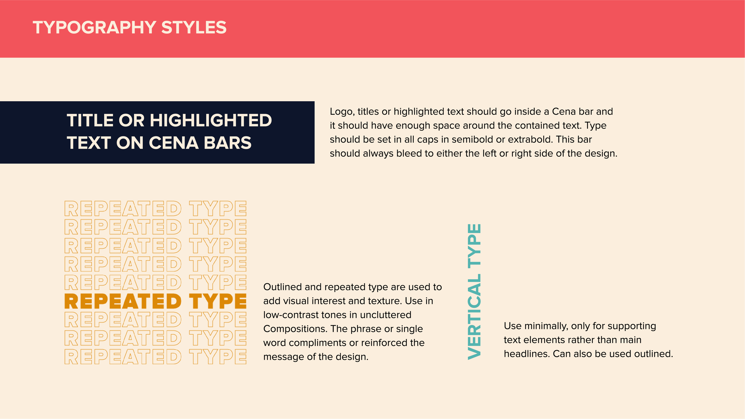
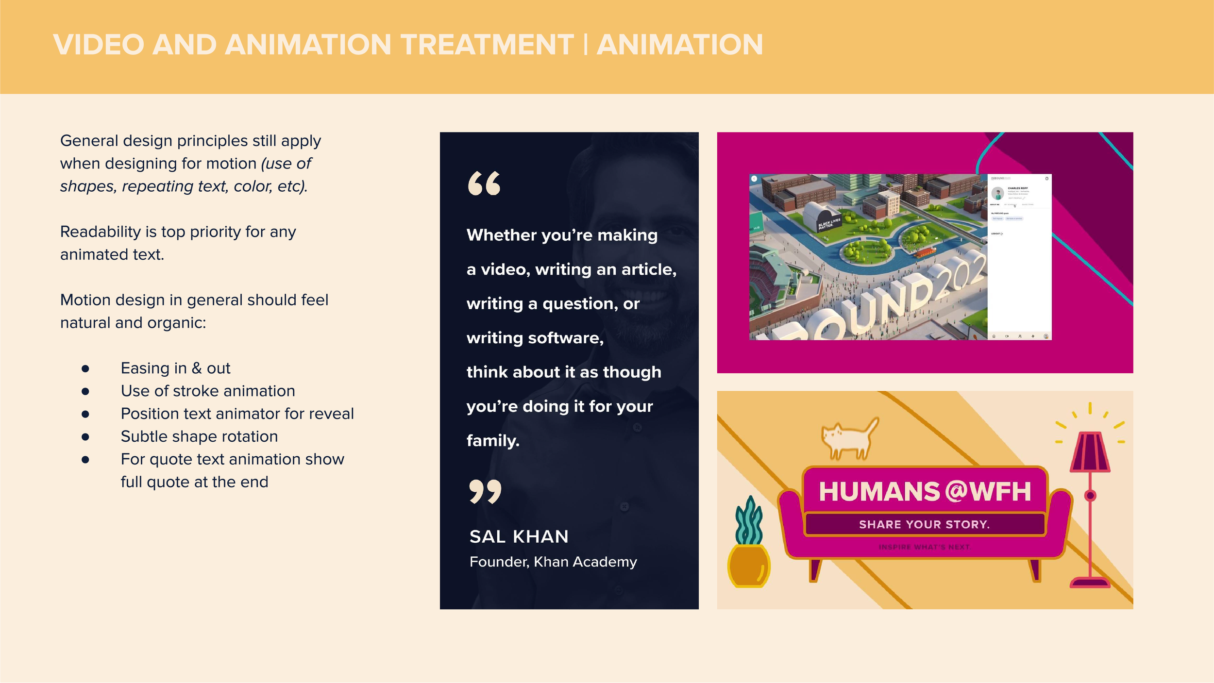
A hand-drawn quality and outlined detailing add a human touch to the geometric forms, balancing their bold scale with a sense of spontaneity and imperfection. This treatment keeps the visuals from feeling overly polished or corporate, introducing personality and warmth while reinforcing the creative, community-driven spirit of the conference.
Together, the vibrant colors, oversized letterform-inspired shapes, and hand-drawn details create an energetic visual language that feels distinctly INBOUND while remaining rooted in HubSpot’s broader brand world. The result is an art direction that transforms the conference identity into something more expressive and experiential, capturing the excitement of discovery, the power of connection, and the endless possibilities that emerge when people come together to move business forward.