HubSpot Creators
Art Direction and design
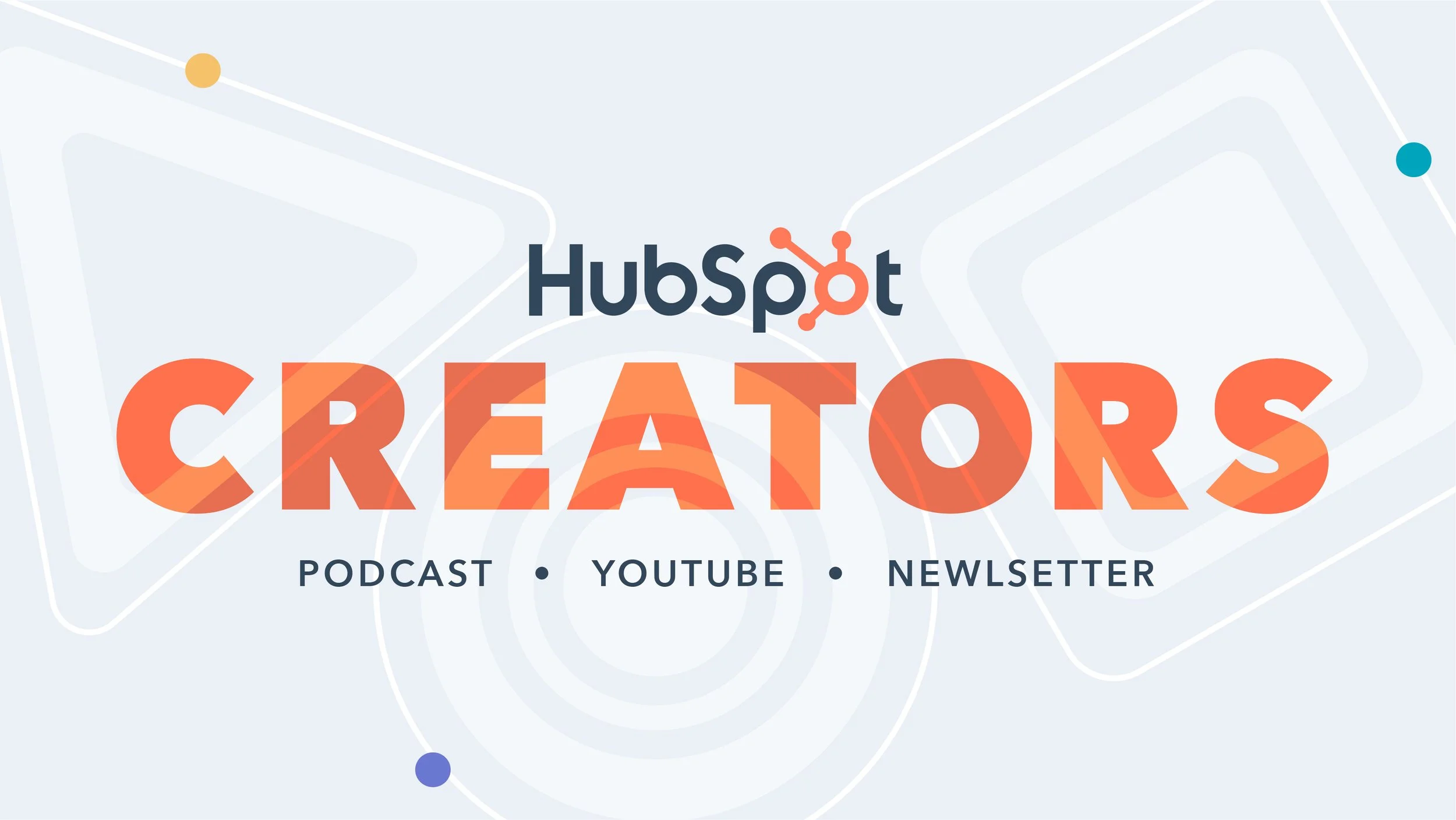
HubSpot Creators is a program that partners with best-in-class creators and thought leaders to produce content that educates, inspires, and drives results across the HubSpot ecosystem. The program brings together three distinct content networks: the HubSpot Podcast Network, HubSpot YouTube Network, and HubSpot Newsletter Network, each offering a unique way to share expertise, spark ideas, and connect with audiences.
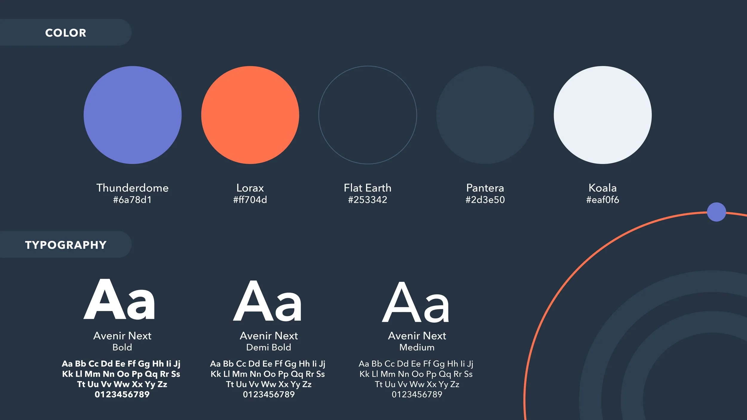
The challenge was to develop a cohesive art direction for all three programs that felt distinctly their own while remaining rooted in HubSpot’s established brand identity. The visual system needed to create recognition across the broader HubSpot Creators umbrella while giving each network a recognizable personality that reflected its content format and audience.
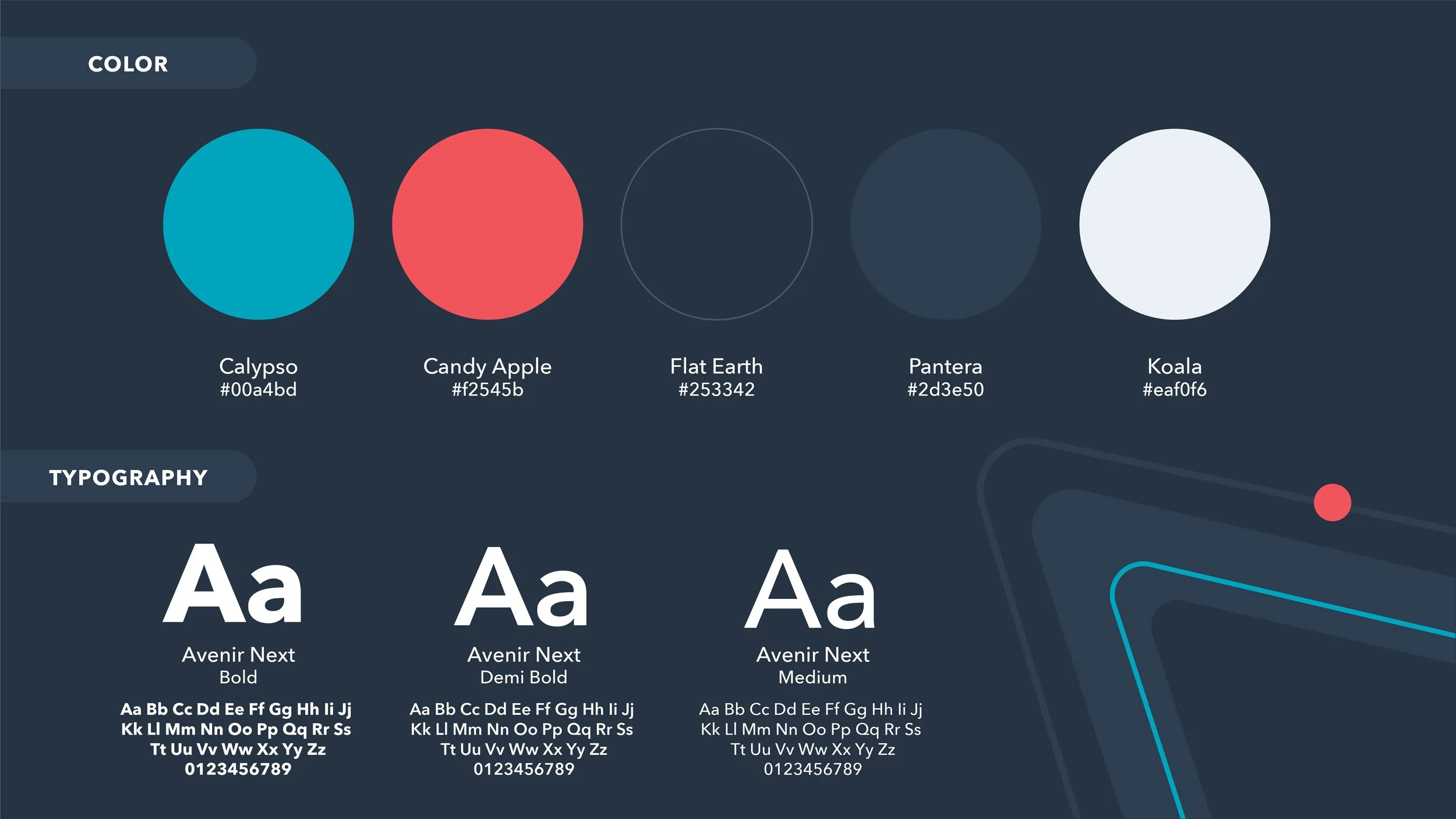
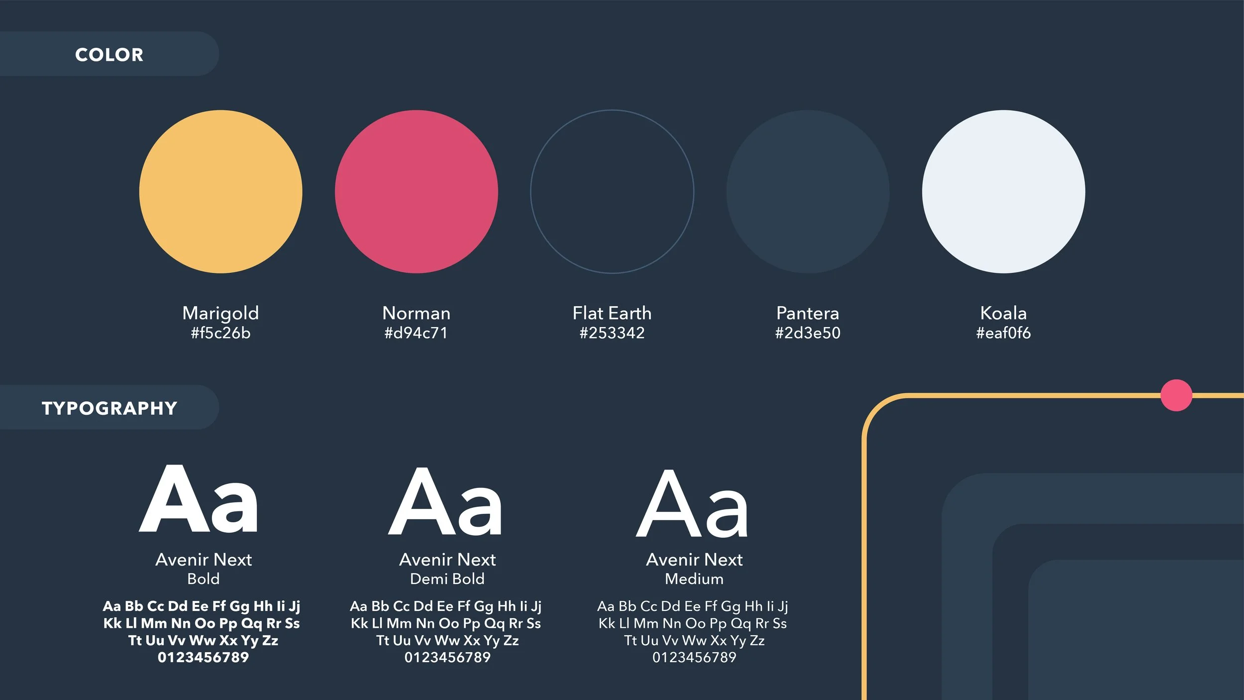
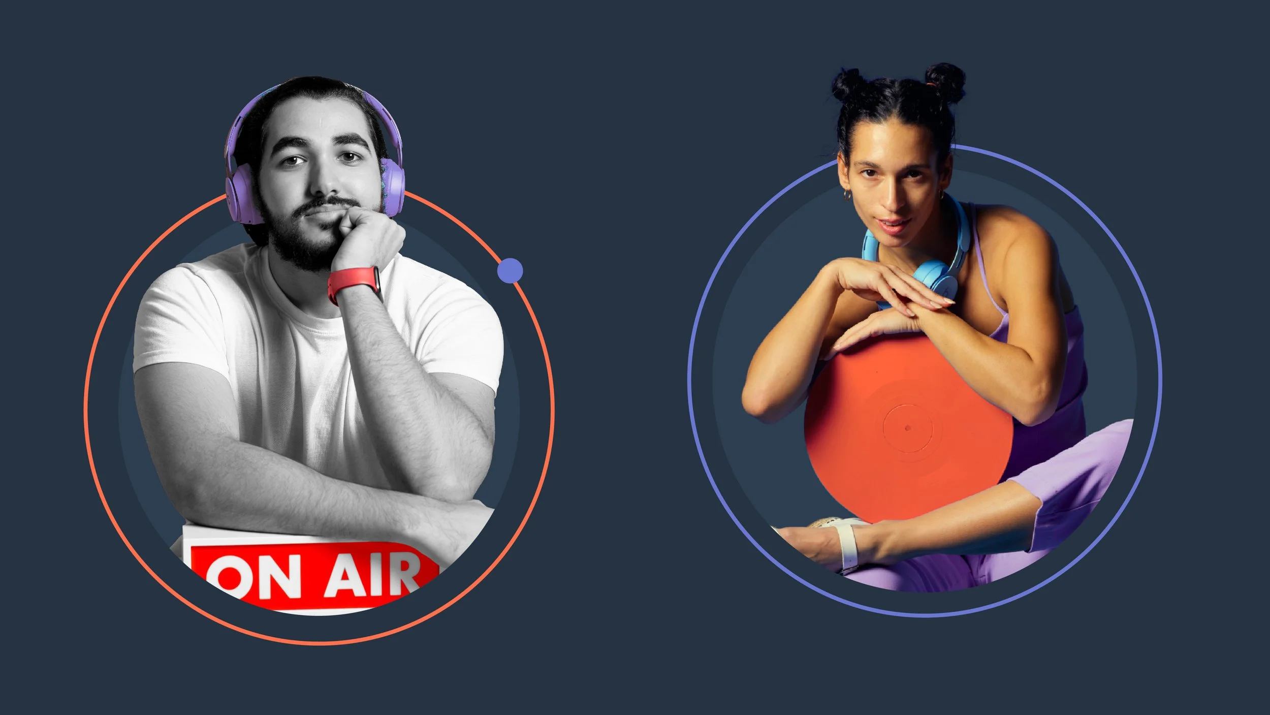
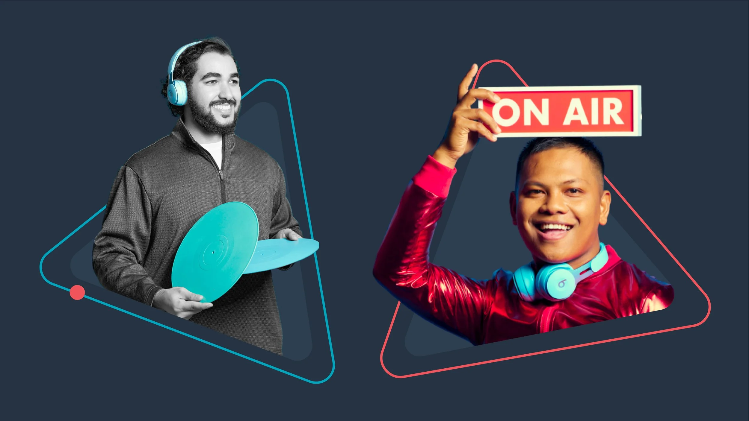
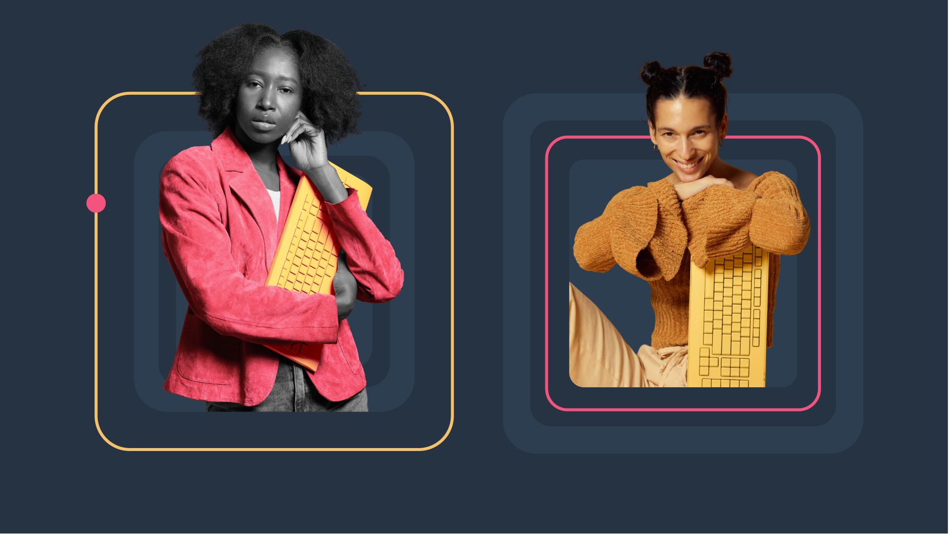
To achieve this, each program was assigned a focused color palette and a unique geometric shape language inspired by its respective medium. Circles represent the Podcast Network, evoking speakers and the sharing of ideas through sound. Triangles represent the YouTube Network, referencing the familiar play button and the immediacy of video content. Rectangles represent the Newsletter Network, drawing inspiration from keyboard keys and the written word. These shapes serve as the foundation of each program’s visual identity, creating a simple yet meaningful connection between form and function.
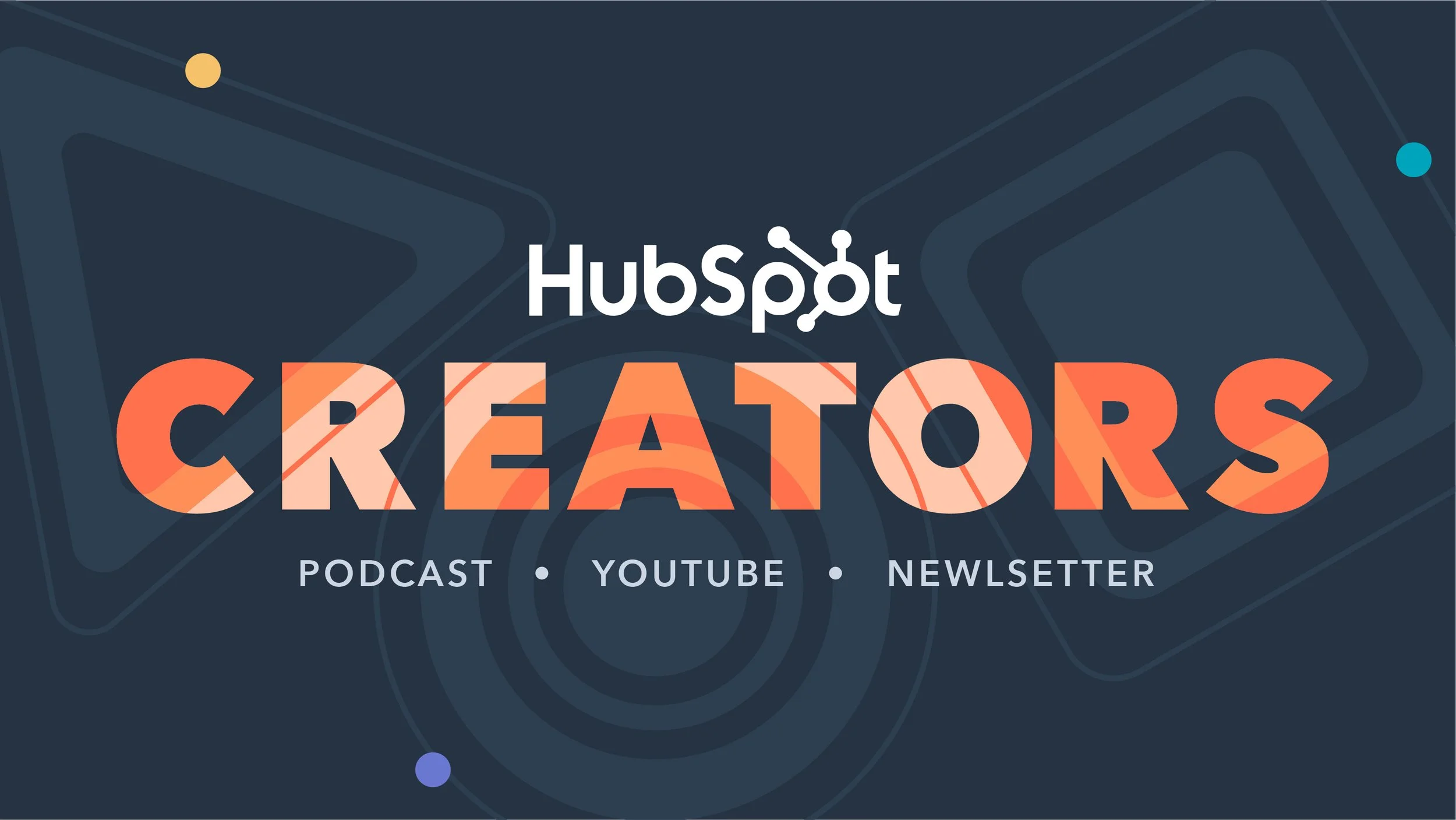
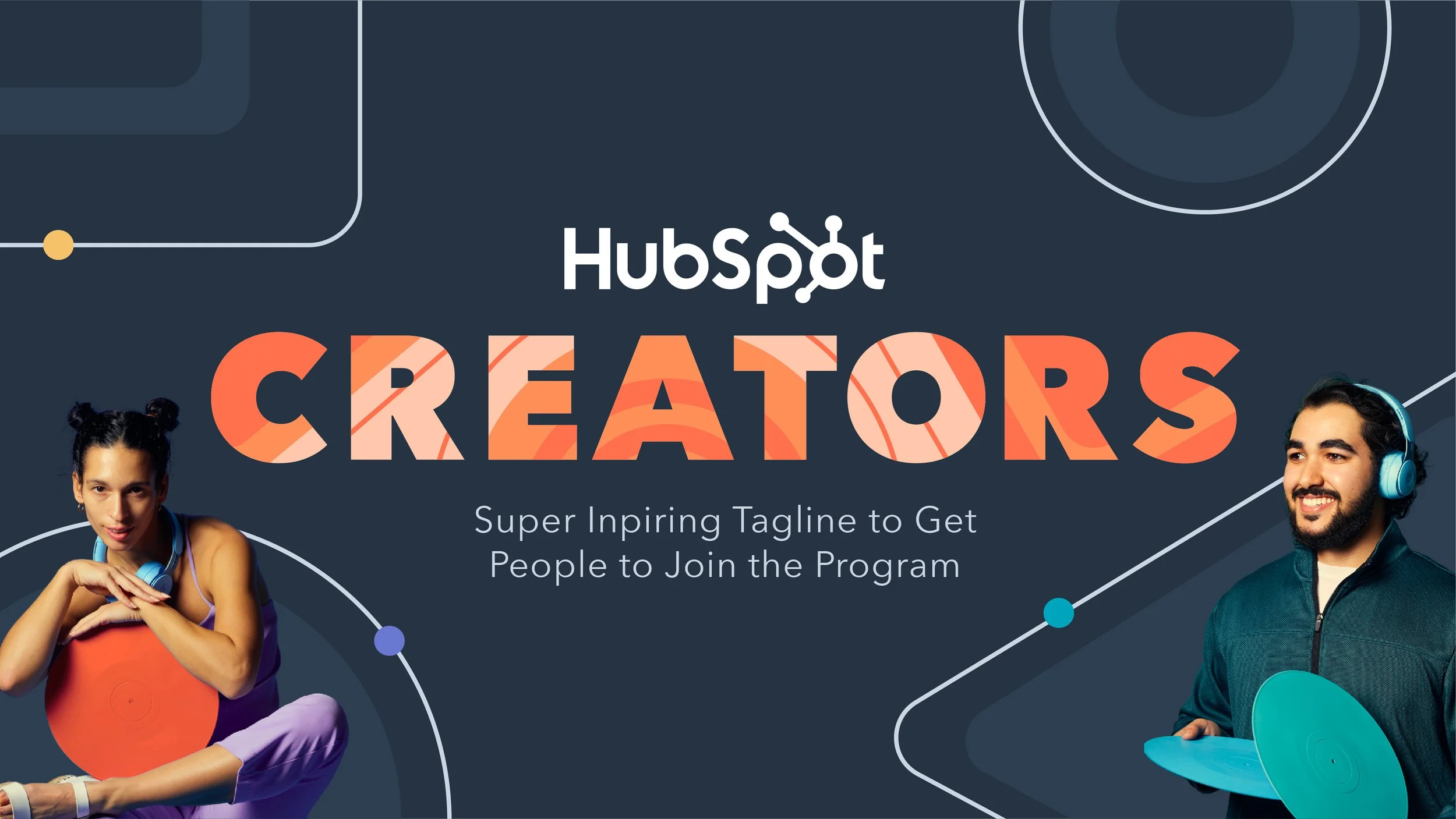
When brought together under the HubSpot Creators umbrella, the three shape languages combine to create a more expressive visual system. The shapes interact to form distinctive patterns across wordmarks, backgrounds, and supporting graphics, symbolizing the different ways creators share ideas and the collective impact of the network. This flexible approach allows the overall Creators identity to feel dynamic and unified without losing the individuality of its three programs.
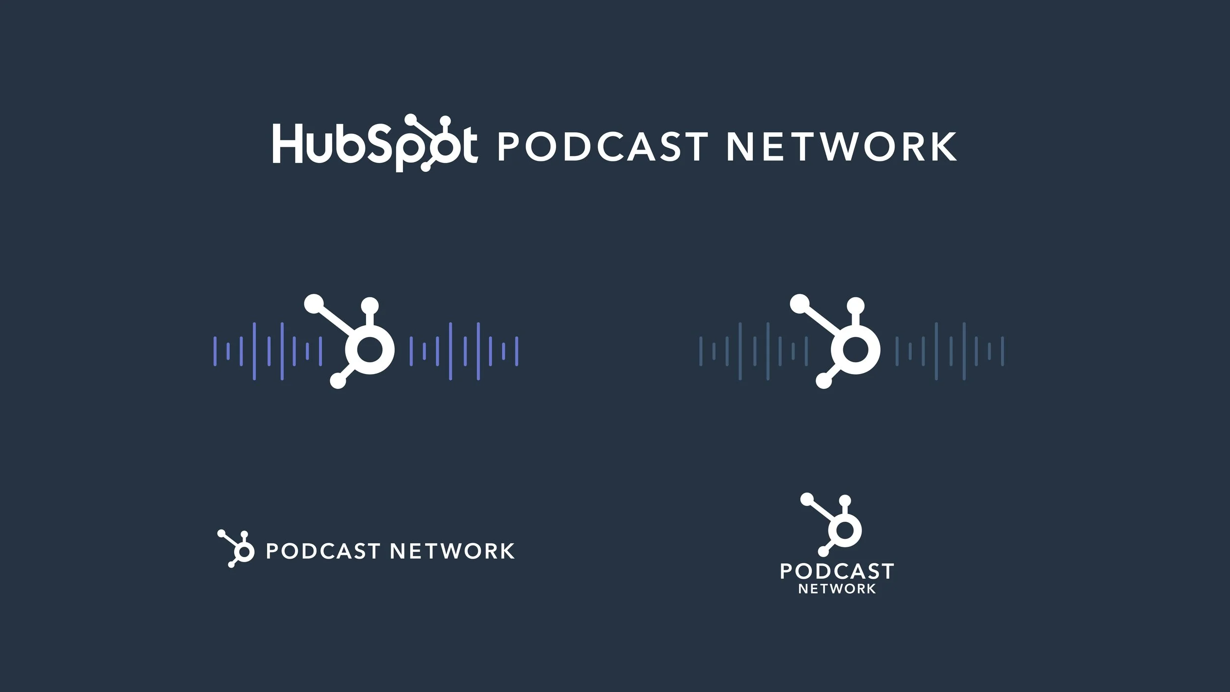
Each network also received a custom logo treatment incorporating HubSpot’s existing sprocket, reinforcing its connection to the parent brand while giving it a distinct identity within the larger ecosystem. Through thoughtful use of color, geometry, and logo design, the art direction strikes a balance between brand consistency and creative differentiation.
The result is a modular visual system that brings three content networks together under one recognizable identity. It builds on HubSpot’s established brand equity while giving each program the flexibility and personality needed to connect with its own audience, creating a cohesive and scalable foundation for the continued growth of HubSpot Creators.